«Back ·
Tracking: {
'Country Code': 'US',
'Language Code': 'EN-US',
'Email Hash': 'unknown',
'Vendor User Id': 'unknown',
'Vendor Id': 'unknown',
'Customer Type': '',
'Offer Code FONT Download


 Designer:
 Adam Ladd
Publisher: Adam Ladd
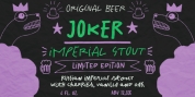
Gopher is a reverse contrast, geometric sans serif typeface with Normal, Text, and Display families. The 48 included fonts in the complete family range from hairline to heavy, with italics. A variation in the amount of contrast is what distinguishes the three separate families, while allowing them to still work in harmony together.
A typical contrast for typefaces is vertical (sides and stems are thicker and the horizontal tops and bottoms are thinner), but Gopher provides a unique look to the geometric sans genre by switching that contrast so the sides are thinner and tops and bottoms thicker. This approach was the most tricky to design in characters that have diagonal strokes, like v and k, but also yielded interesting results.
Text styles have the most subtle reverse contrast so they work best in smaller type settings and adhere to conventions a bit more. Normal styles have a moderate contrast where the unique characteristics are more evident. Display styles are the most dramatic as the contrast has been pushed more to the extreme for an immediate visual impact.
Gopher includes many OpenType features to enhance your typography:
• Swash capitals
• Stylistic alternates (a, J, I, 0)
• Standard and discretionary ligatures
• Case-sensitive punctuation for All Caps
• Fractions, superscript, subscript
With over 600 glyphs, this font has extensive Latin language support (100+ Latin languages) for Western, Central, and South Eastern European. Gopher will work great in a variety of settings for branding, advertising, posters, magazines, packaging, and more.